Bozeman IV
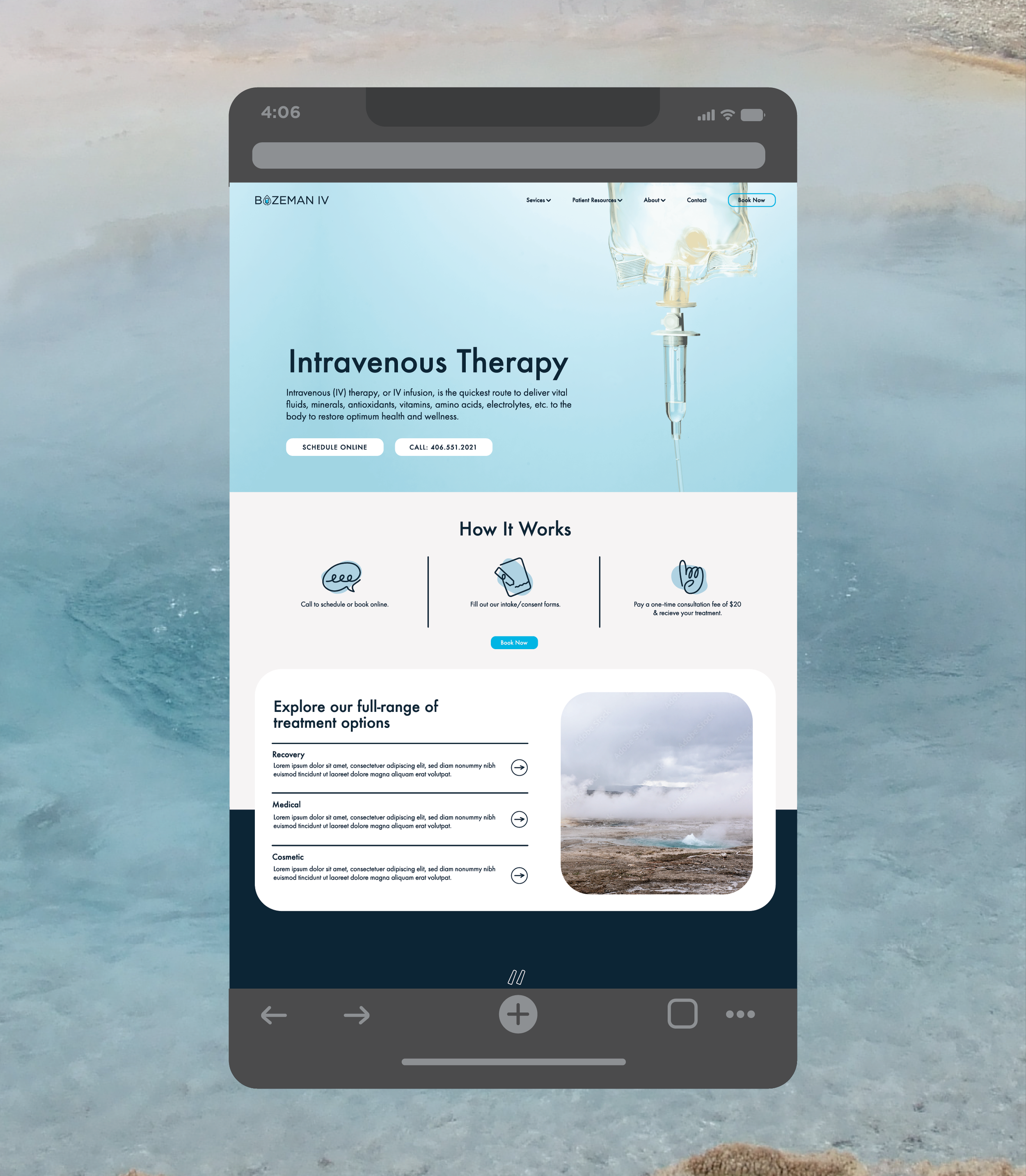
Logo Design Van Decal Web Design
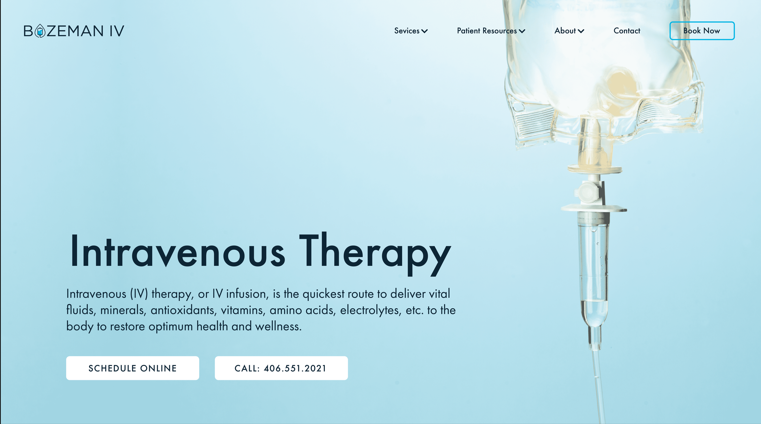
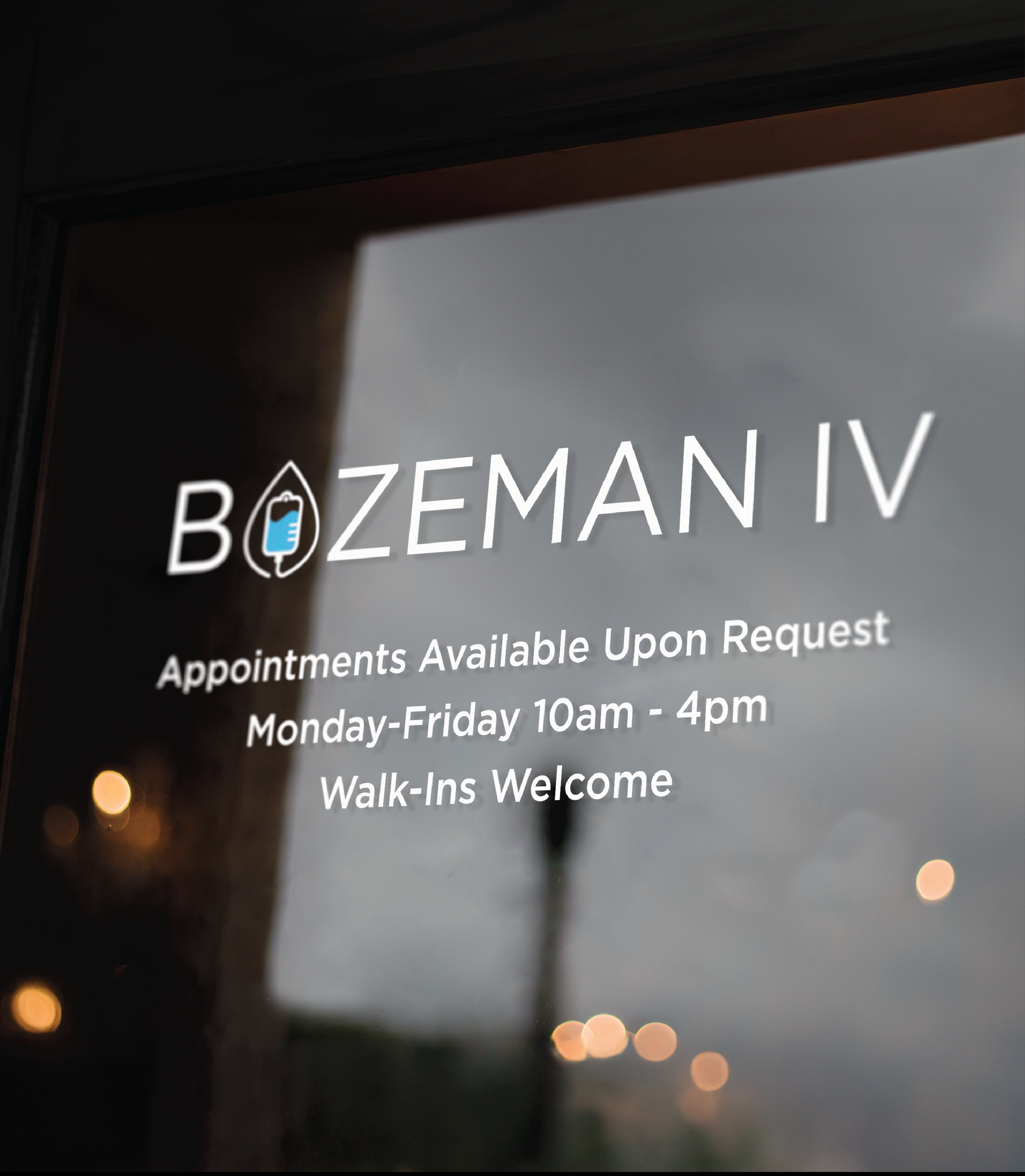
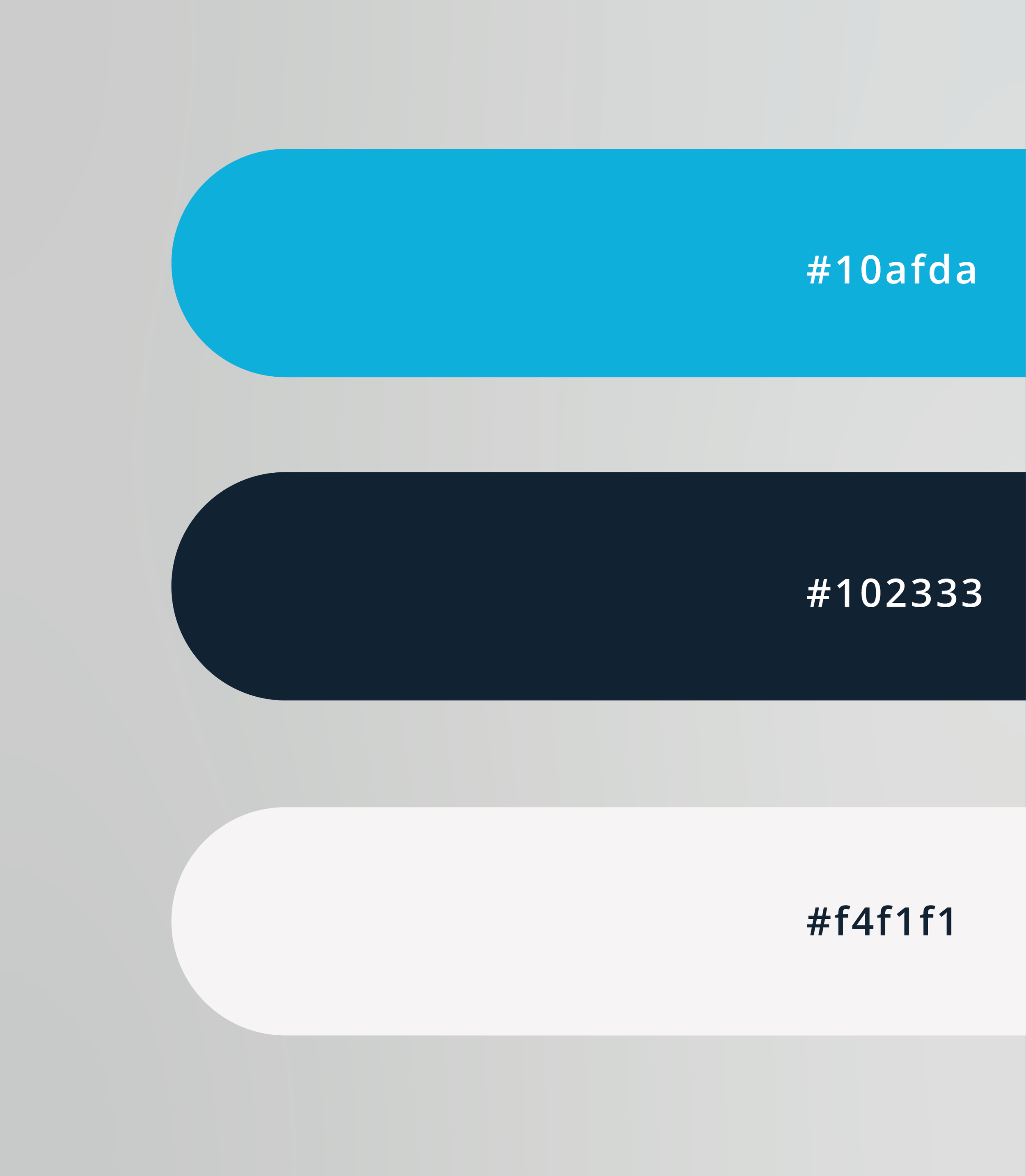
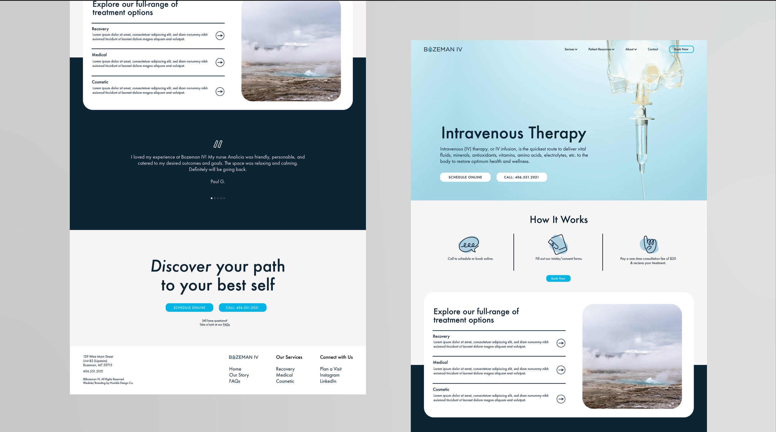
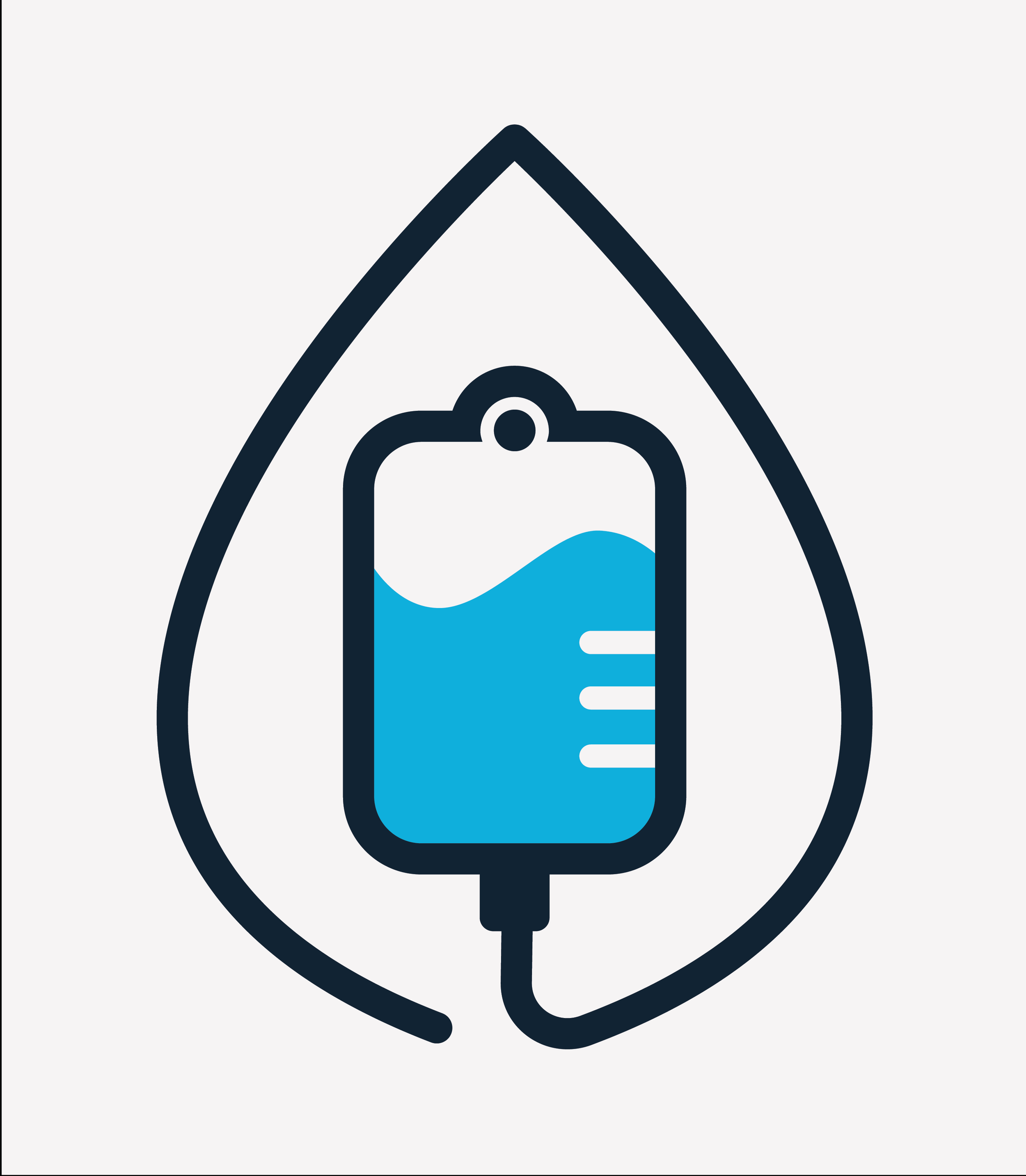
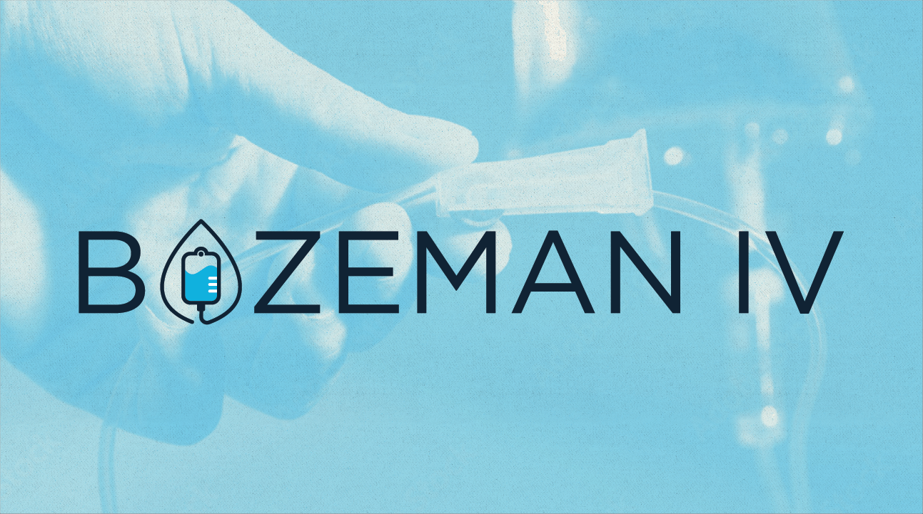
Bozeman IV approached us to design a logo reflecting their commitment to medical expertise and patient comfort. The resulting design features a stylized IV bag and drip line as the “O” in Bozeman, with a subtle hint of mountain peaks in the saline solution—a nod to the local MT landscape. The logo’s soft, rounded serif edges and welcoming aura help put visitors at ease, while the limited palette of blues and off-white conveys a sense of trustworthiness and professionalism. This project captures the blend of care and capability that defines Bozeman IV.